Website Audit and Redesign
@ Planet Oat
Outcome
Planet Oat is a US-based oat milk brand found in stores all over the country. Being new to the alt-milk category they wanted to find a way to differentiate themselves from competitors through storytelling. They tasked my team with a full website redesign after running a successful TV campaign with our agency. We were asked to improve the website experience, add features, and integrate the new campaign visuals and storytelling into the site.


Overview
Time:
3 months
My role:
Heuristic web audit
Support content audit
Site map
Wireframes
Process
Step 1. Audit the website using Nielsen Norman heuristics as criteria.
I reviewed the entire website and all interactions on desktop and mobile and judged them by how well they executed on the NN heuristics - rules of thumb like user control & freedom, and recognition over recall. The below image is an excerpt from my report deck that I presented to clients.

Key Findings:
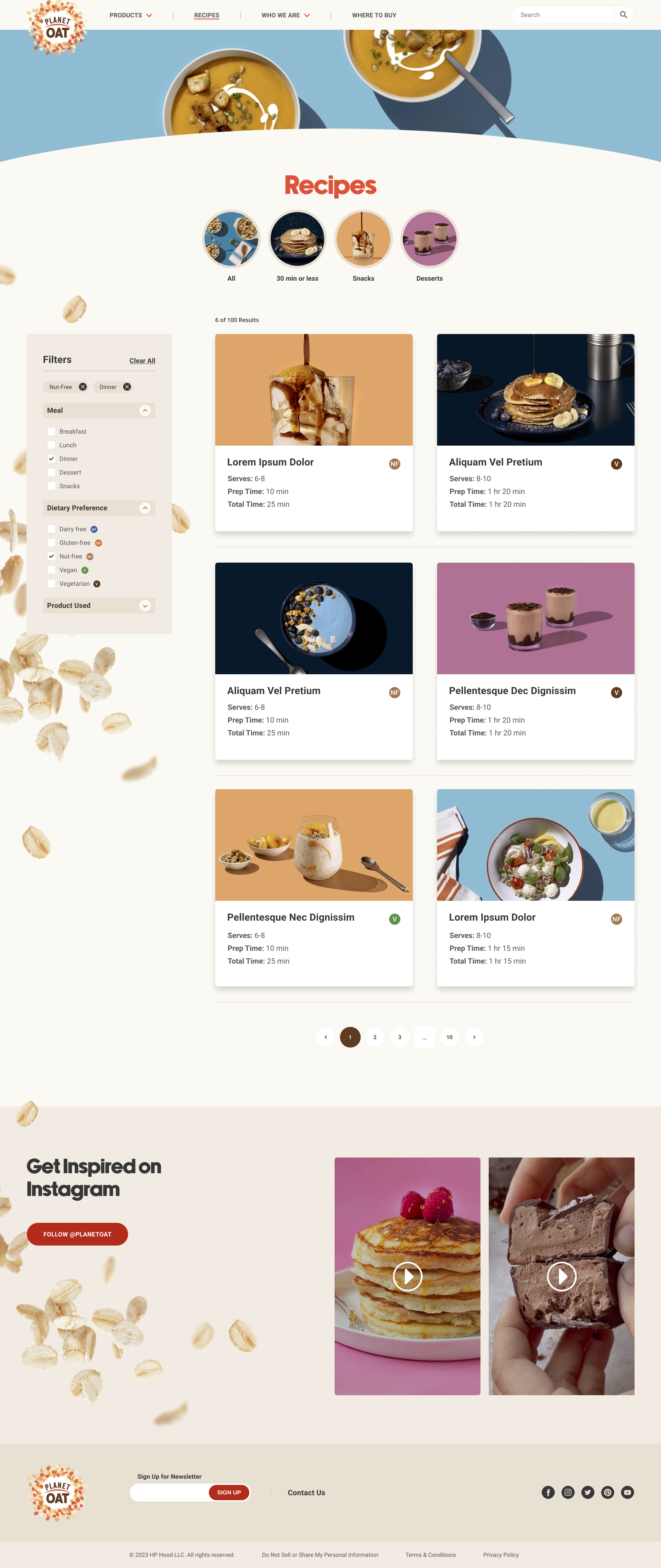
The recipe cards were only clickable on the “See More>” link at the bottom of the card. the CTA was too small and most users will want to just click anywhere on the card to view the recipe.
The recipe page had so many entries, but did not allow for filtering.
The form on the Contact Us page was not laid out in the most organized fashion.
Design and imagery could use a modern lift
Some interactions were not designed mobile-first and suffered in a mobile experience
Step 2. Run baseline user testing
In parallel with the UX audit, my team ran a quick baseline usability test via the testing platform UX Tweak. We tested the current website, desktop and mobile, with 5-7 participants each. The sessions were remote and unmoderated and lasted for 15 minutes. Below are the tasks we created for each participant to complete.

Key Findings:
Overall, users understood the content on the website and gained a positive perception of the brand.
Users did complain about the recipe tiles not being clickable.
Users wanted more nutritional information on the product and recipe pages and to understand why oat milk was a good choice.
Users suggested a mega-menu of products and a search experience.
Step 3. Build sitemap and wireframes

All wireframes were designed mobile-first, but I will show the desktop version here as they are easier to see and read.
Key elements:
More storytelling on the home page about why Oatmilk is a good choice and why Planet Oat could be the best oatmilk for you.
Highlighting key nutrition facts on the product pages and cross-linking to recipes using that product.
Adding filtering to the recipe list page
Adding more interactivity to the recipe pages (copy ingredients, print, share) and nutrition information


Step 3. UI Design
We had originally wanted to lean into the “planet” concept in design and make more space and solar system references. However, the client veered us away from that direction to focus more on earthy ingredients, such as the floating parallax oats. These designs closely reflect what was approved after the wireframe stage.


Lessons
Take charge. This was the very first project I took more of a leading role in. I learned that often projects don’t just happen and people don’t just do what needs to be done. There needs to be someone driving the train, checking in with people, offering help, and keeping everyone on track. I got to test out my communication and leadership skills and it was an invaluable experience.
Protect scope and timeline. During the project we had to manage the client a little bit when it came to meeting timeline deadlines. We would send over designs and ask them to provide feedback within reasonable timeframes and they often struggled to do so. We also had to protect the scope of work and have gentle and strategic conversations with our clients to make sure the project could be finished on time and in budget.


